SALT LAKE CITY INTERNATIONAL AIRPORT | REBRAND
Say Hello to
The New SLC
100 YEAR EVOLUTION
From 1920-2020.
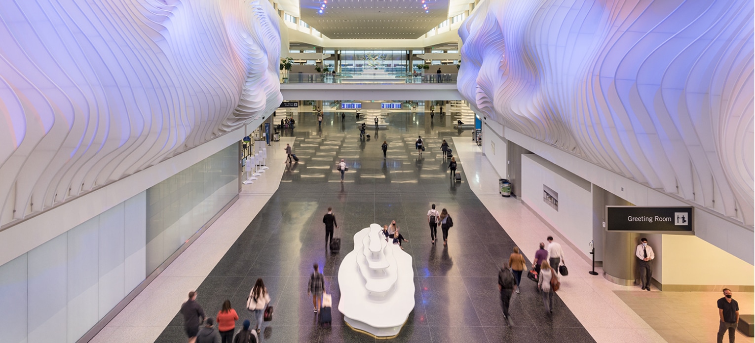
It’s not every day that a new airport needs an introduction. Salt Lake International’s Day came on their 100th anniversary and right in the middle of a worldwide pandemic. How could the airport showcase their new facilities at a time when much of the world was shut down, many flights had been grounded, and people were cautious of stepping outside their homes, let alone onto a plane.

Educating the public about The New Salt Lake City International Airport became a central theme of nearly every communication effort to increase understanding and build confidence in safe travel. Love worked with airport management to develop videos, kiosks, trade show materials, and traveler brochures to enhance awareness efforts.
Throughout it all, we were challenged to think creatively and strategically to strike the right tone, deliver the clearest information possible, and quickly adapt events and marketing efforts.
#1 GOAL
Public education.
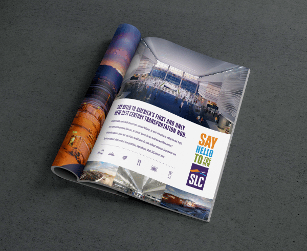
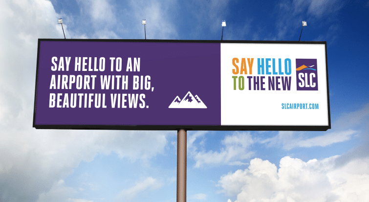
Before we could update the website and create a new mobile app, we had to assess traveler research to gauge their awareness, emotions, and needs.
We knew that the project would also include a new branding initiative, a grand opening that would have to be virtual, and a campaign to build excitement.
We just weren’t sure how to pull it all off with the restraints the pandemic placed on us.
14 UNIQUE TACTICS
Were initiated as part of the campaign.

6,000 VIEWERS
Participated in our virtual grand opening.
To help organize our efforts, we divided 4 unique campaign tactics into strategic categories—Experience, Emotion, Education, Engagement. There was overlap, of course, but these four categories served to ground and align us as we tackled the project.
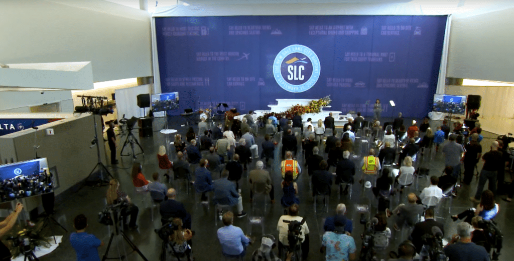
Experience—most would need to be virtual. We held a virtual grand opening which garnered more than 6,000 viewers – giving so many the opportunity to be a part this grand unveiling from anywhere in the world.
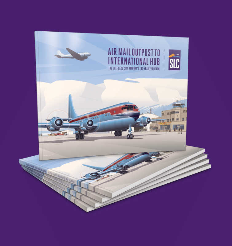
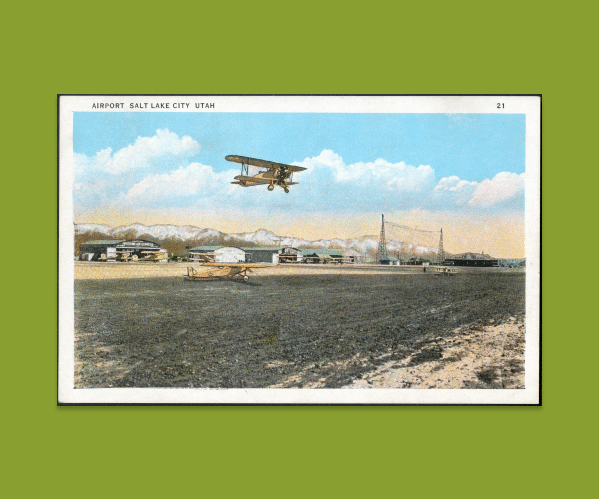
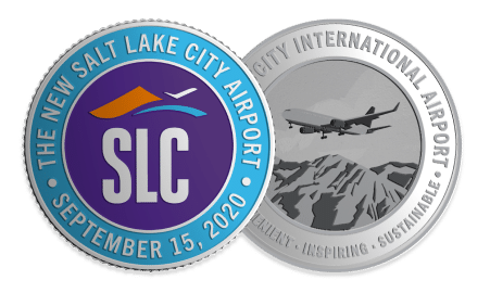
Emotion—nostalgia and a longing for connection. We helped craft a 100-year anniversary book celebrating the airport’s history and the shared experiences found within it. We also created a collectible coin to commemorate the event.
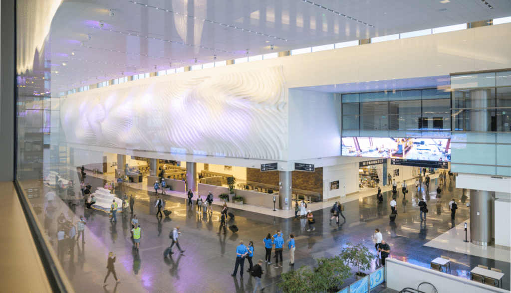
Education—people fear what they don’t understand, so with pandemic anxiety already at record levels, education was paramount. We produced a “Fly Healthy Promise” video, created brochures, booth displays, and more to empower our audience with information.
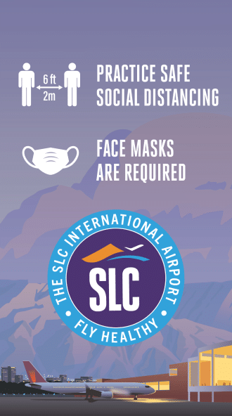
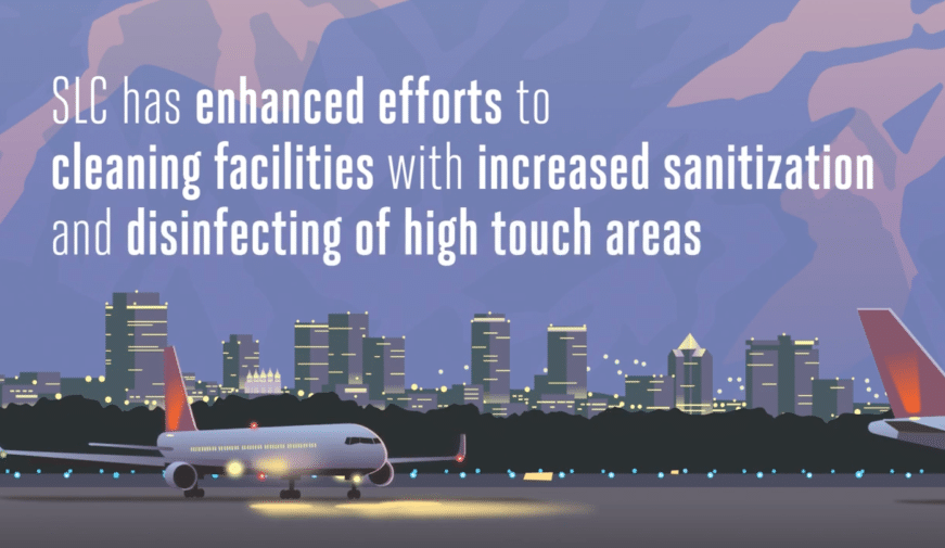
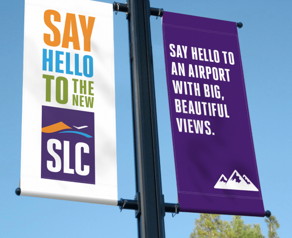
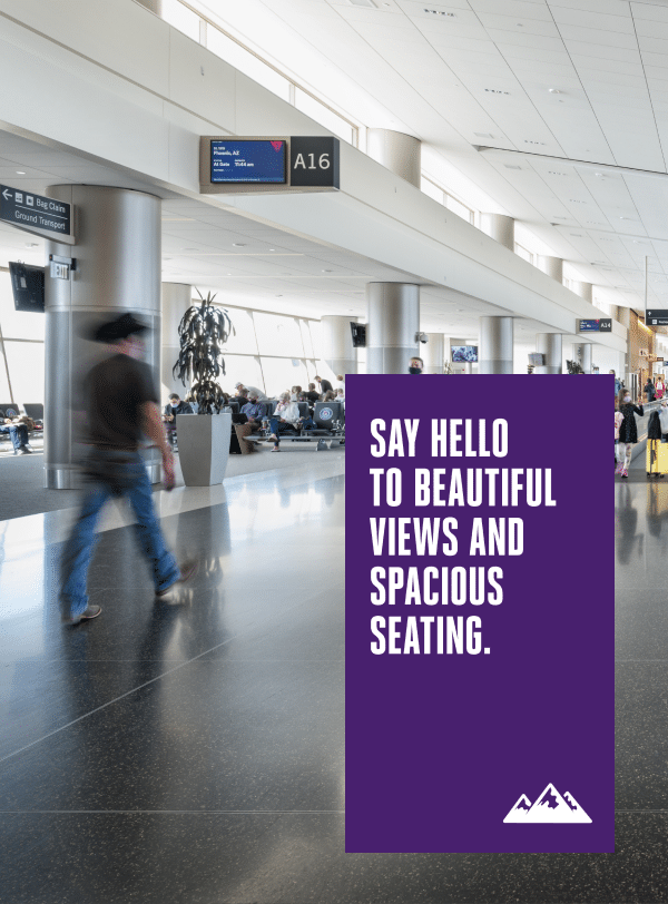
Engagement—getting people involved early and often. Our mobile app design and development engaged travelers looking for assurances, news, and a seamless experience. Similarly, the site design was updated for easy interactions, enhancing every traveler’s sense of safety and security. Finally, internal signage was thoughtfully crafted to help people navigate the new airport easily, follow travel safety rules, and enjoy a positive travel experience.
Finally, we brought each of our four areas of focus together into an omni-channel advertising campaign including tv commercials, transit signage, radio, pre-roll, display ads, and more.
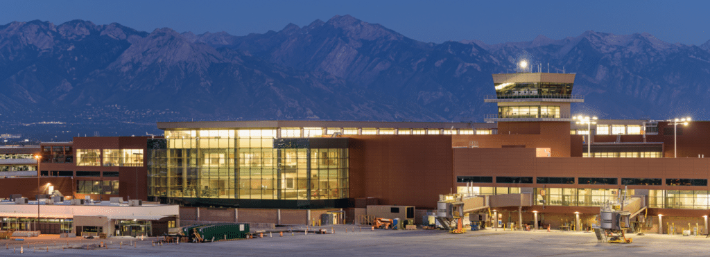
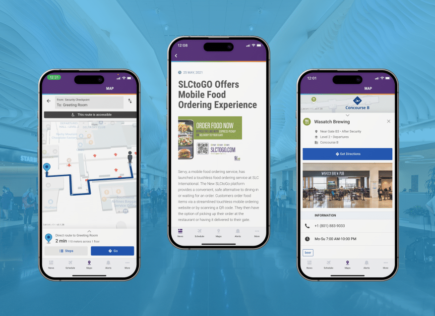
The success of such a large and prominent endeavor has resulted in an ongoing relationship with the airport. We continue to support them to this day, across all facets of their marketing needs.

RIO TINTO | NUTON WEBSITE
Transforming the Copper Industry
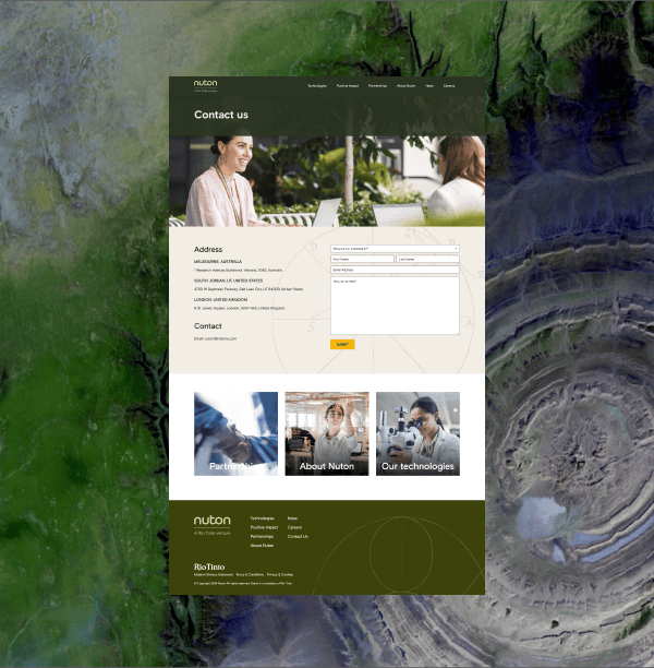
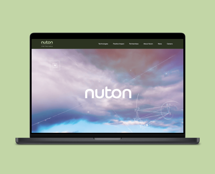
When Nuton, a Rio Tinto venture, was ready to introduce its innovative approach to copper production to the world, they came to us for web design and development. Their goal was clear: create a website that would attract new partnerships, draw in top talent, and establish Nuton’s unique position within the industry.
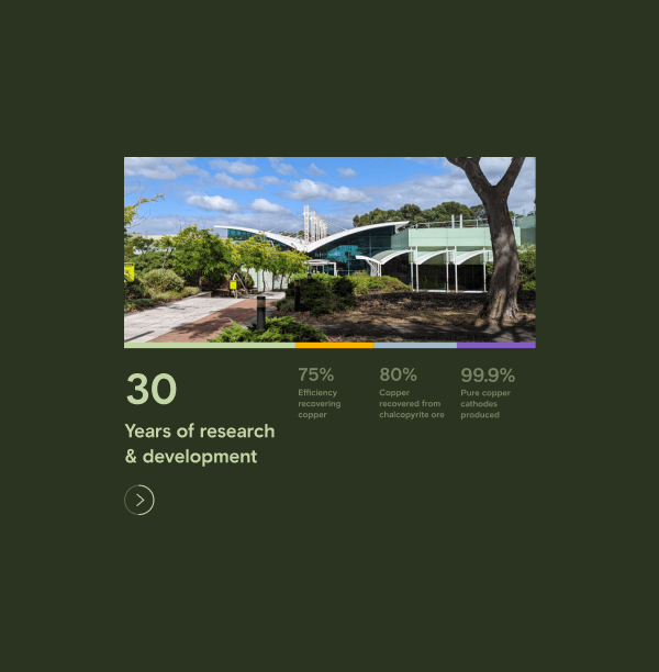
The results were immediate: within a few days of the site launch, it gained significant traction, with organic search driving 36% of all traffic and more than 50% of all sessions classified as engaged sessions.
> 50% SESSIONS
were engaged users
20+ SEARCH TERMS
ranking in the first 4 months
Backed by over 30 years of research and development, Nuton’s impressive copper recovery technology demanded a website that was both informative and visually compelling.
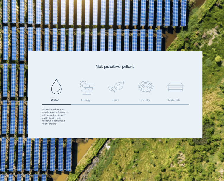
One of our main challenges was to present Nuton’s highly technical information in a way that wouldn’t overwhelm users. To address this, we organized the content into intuitive web experiences that paired concise messaging with carefully curated visual elements. This approach allowed users to explore the site freely, guided by a seamless experience that ultimately led them to connect with Nuton.
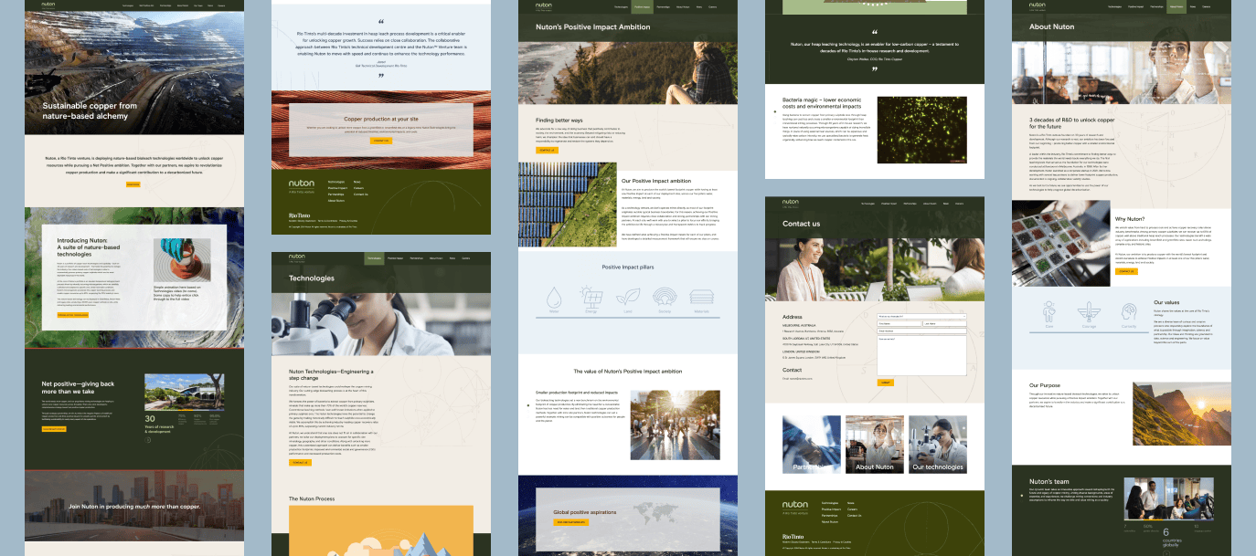
Within the first few days, over half of user sessions were classified as engaged. Although the brand’s visual identity was pre-established, we developed new design systems that brought Nuton’s site to life. The site includes animations inspired by Sir Isaac Newton’s equations, scroll-capture elements that narrate micro-stories, and strong calls to action. This design strategy made the site feel dynamic, modern, and engaging—a true reflection of Nuton’s innovative spirit.
36%TRAFFIC SHARE
from organic search
The design worked—conversion rates for contact forms and job inquiries exceeded global benchmarks by more than 400%. Almost instantly, the site became discoverable, with more than 20 keywords driving quick traffic.
400%
above the global benchmark
Supported by press releases and digital mentions from Rio Tinto, the site quickly gained traction and became a key tool in Nuton’s global outreach efforts.
The strategic combination of visually compelling design, clear messaging, and targeted search optimization ensured that Nuton’s message reached a wide audience, driving both user engagement and conversions at levels well above global web industry benchmarks.

UTAH DEPARTMENT OF HEALTH AND HUMAN SERVICES | HIV AWARENESS
Humanizing HIV
How do you break the stigma around HIV? And in a state that had never run an awareness campaign for the cause until 2020? The “H is for Human” campaign—run in partnership with the Utah Department of Health and Human Services—not only shifted the narrative around HIV but also contributed to a 6.5% increase in familiarity with HIV as a public health issue.
For this unprecedented campaign, we knew we needed a message that would challenge deep-rooted stigmas, encourage open conversations, and drive meaningful action.
6.5% INCREASE
in familiarity with HIV as a public health issue
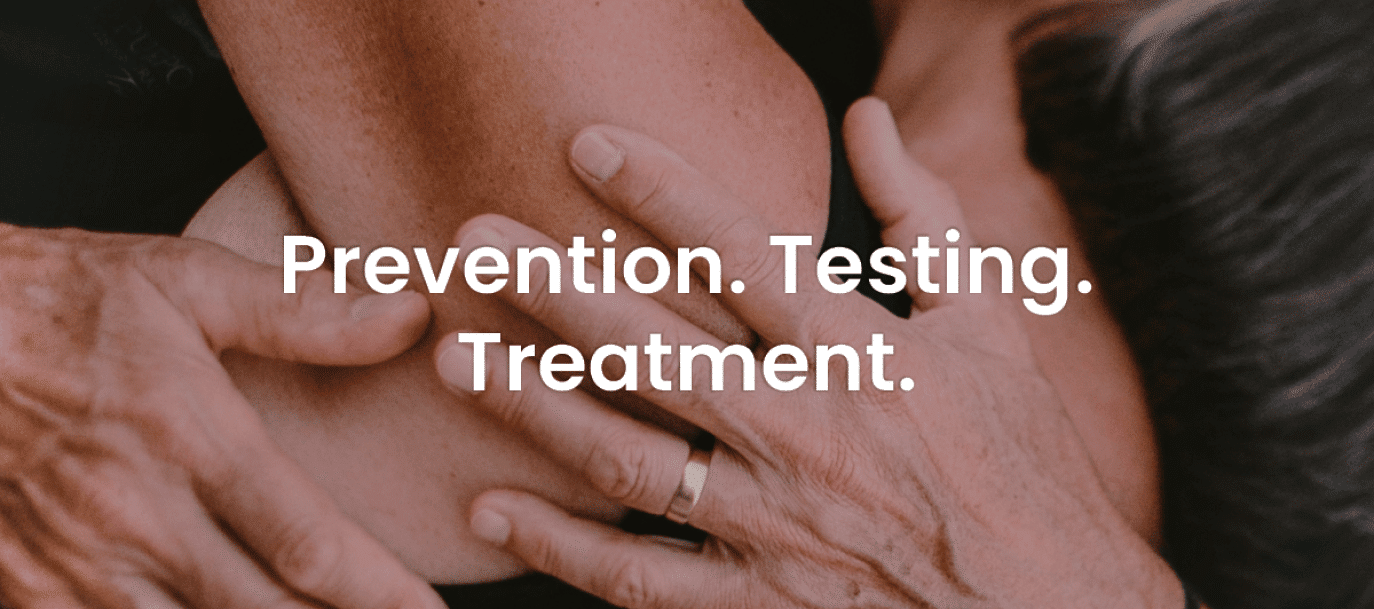
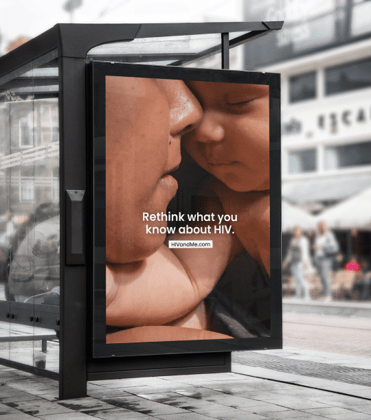
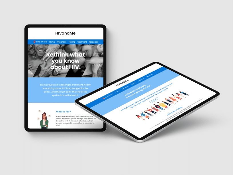
The “H is for Human” campaign, which ran from 2020 to 2022, was designed to tackle HIV prejudice head-on. Our creative and media teams developed a compelling statewide advertising campaign and comprehensive resource website, HIVandMe.com.
LIFT IN 9 OF 12 KEY KNOWLEDGE AREAS
around commonly misunderstood facts and fictions related to HIV
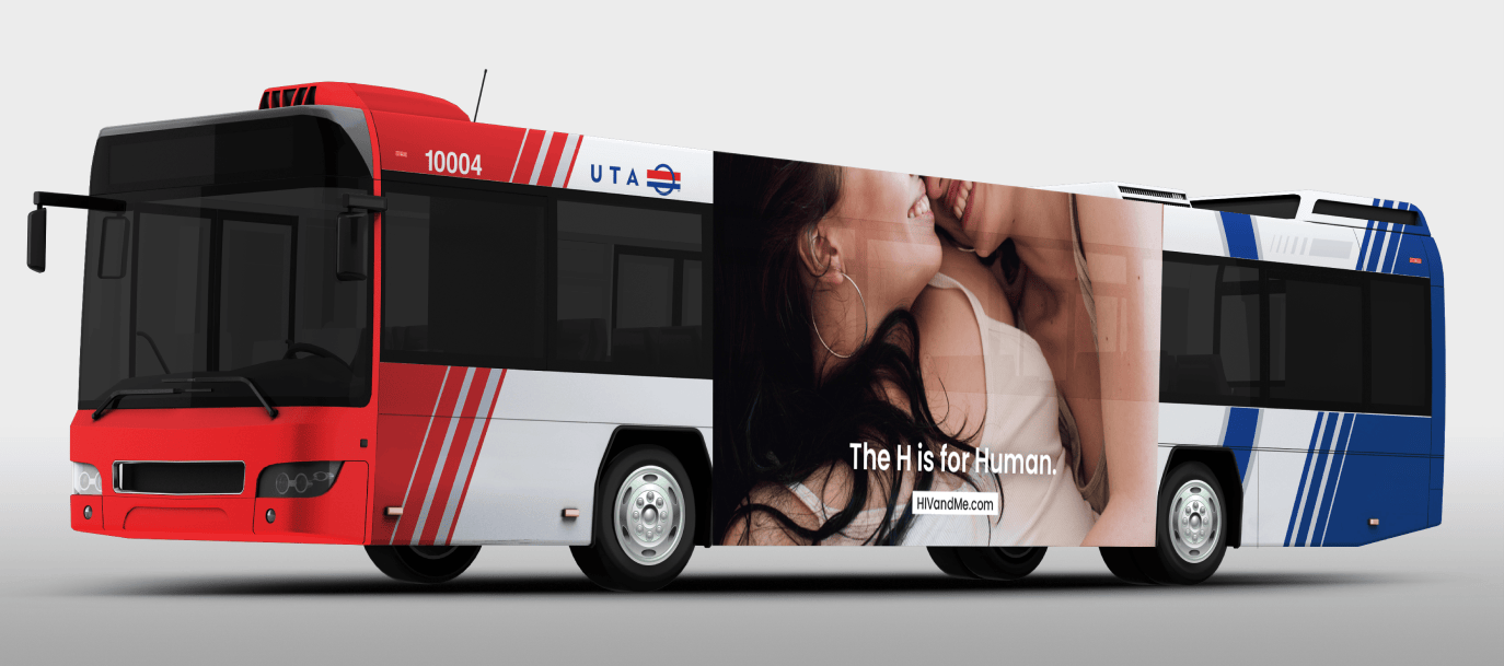
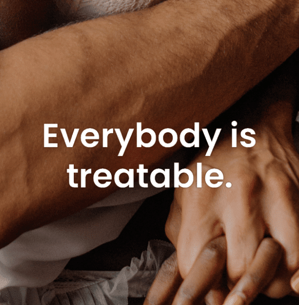
Our success was rooted in our creative and strategic approach. Featuring abstract close-up photography of humans in various relationships, paired with simple, impactful headlines like “H is for Human” and “A Diagnosis Doesn’t Define You,” the campaign humanized HIV and challenged existing misconceptions. This messaging proved effective, leading to a measurable lift in 9 of 12 key knowledge areas around commonly misunderstood facts and fictions related to HIV.
52.3 MILLION
digital impressions
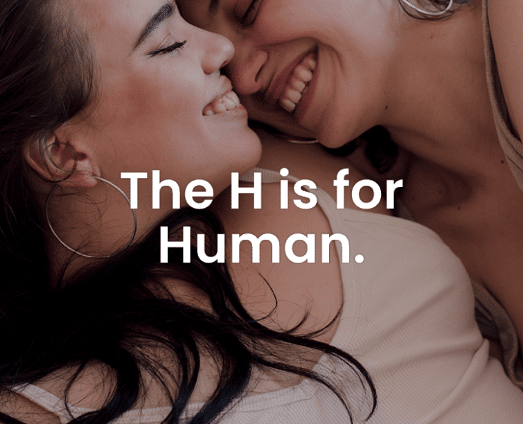
The campaign, which targeted both English- and Spanish-speaking audiences, provided critical information and resources to at-risk groups about prevention, testing, and access to treatment. Working closely with the Utah Department of Health and Human Services, we produced various creative materials, including billboards, web banners, bus boards, programmatic display and pre-roll ads, social media, and TV ads. We wanted to ensure broad reach across the state and engagement across multiple platforms. The campaign’s second phase introduced testimonials, adding a personal, relatable layer that resonated deeply with the audience.
> 42,400 PAGE VIEWS
to key conversion points.
The impact was clear—digital efforts alone delivered over 52.3 million impressions, driving more than 42,400 pageviews to key conversion points on the website, such as “learn more” and
“find a clinic.”

The “H is for Human” campaign not only shifted public perception but also made a tangible difference in the lives of Utahns. Through creative storytelling with strategic media placement, we effectively humanized HIV, increased awareness, and encouraged more people to get tested as well as seek prevention and treatment.

